
In the rapidly changing world of web development, designing visually appealing and responsive layouts is crucial. Thanks to Flexbox and CSS Grid, developers now have powerful tools to create intricate and dynamic web designs. This web development course goes in-depth into these two layout systems, giving learners the skills to craft flexible, responsive, and visually captivating web layouts.
Grasping the Basics
The Web Development Course kicks off by elucidating the fundamental concepts of HTML and CSS, prerequisites for comprehending advanced layout systems. Participants dive into the structural components of web pages, learning how HTML forms the backbone and CSS adds styling and visual appeal.
Exploring Flexbox: A Dynamic Approach to Layouts
Flexbox, short for Flexible Box, revolutionizes the way layouts are constructed. Its flexible nature empowers developers to design adaptive and responsive interfaces effortlessly. Participants delve into the core principles of Flexbox, understanding its properties such as flex-direction, justify-content, align-items, and more. Through hands-on exercises, learners gain proficiency in using Flexbox for both simple and complex layouts.
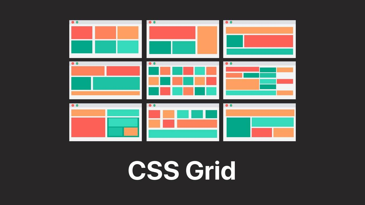
Unleashing the Power of CSS Grid
Complementing Flexbox is CSS Grid, a two-dimensional grid-based layout system. This part of the course demystifies CSS Grid's intricacies, enabling participants to create sophisticated and intricate layouts with ease. From defining grid containers to placing items within the grid using grid-template-areas and grid-column, learners master the art of crafting visually stunning web designs.
Integrating Flexbox and CSS Grid in Web Development Course
The Web Development Course converges Flexbox and CSS Grid to demonstrate their collaborative potential. Participants discover how combining these layout systems allows for greater flexibility and precision in web design. They learn to utilize Flexbox for handling content within individual components and CSS Grid for structuring the overall layout, resulting in visually cohesive and responsive web pages.
Real-world Applications and Projects
A crucial facet of this Web Development Course lies in its practical applications. Learners engage in real-world projects, applying Flexbox and CSS Grid to create diverse layouts. From crafting responsive navigation bars to designing complex multi-column structures, participants gain hands-on experience through guided projects, reinforcing their understanding of these layout systems.
Web Development Course in Pakistan: Empowering Future Developers
Web development course in Pakistan, the burgeoning tech industry beckons aspiring web developers to acquire cutting-edge skills. This course caters specifically to the Pakistani audience, aligning its curriculum with industry demands. By mastering Flexbox and CSS Grid, participants are poised to contribute significantly to the country's digital landscape.
Career Prospects and Opportunities
The demand for skilled web developers in Pakistan is burgeoning. Armed with the knowledge gained from this course, individuals can explore various career opportunities. From working as freelance developers to joining reputable tech companies, the skills set acquired proves invaluable in the competitive job market.
Final words:
The Web Development Course focusing on Flexbox and CSS Grid is a pivotal step for aspiring developers. It provides a hands-on approach to mastering contemporary layout techniques, enabling the creation of visually captivating and responsive web designs. This course is indispensable for those venturing into web development, offering essential skills for crafting user-friendly layouts.
Enroll in this Web Development Course today and embark on a journey towards mastering Flexbox and CSS Grid, elevating your skills and opening doors to a myriad of opportunities in the vibrant realm of web development.


0 Comments